
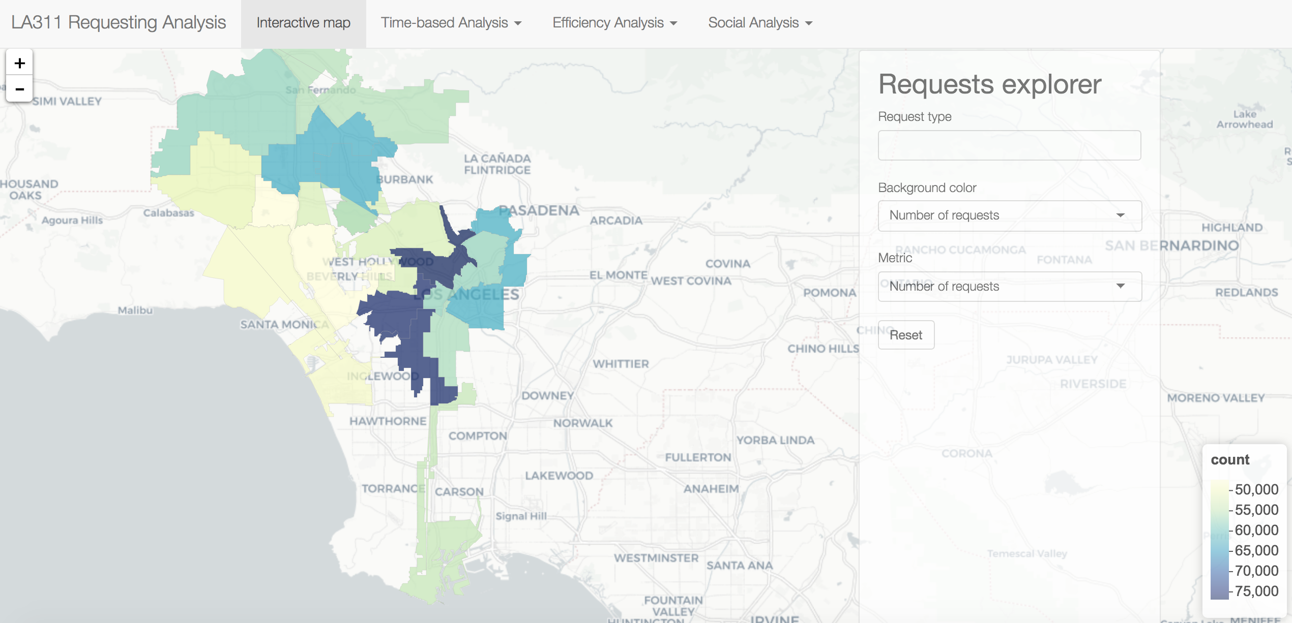
Interactive Homeless Tracker Dashboard for Los Angeles City and County
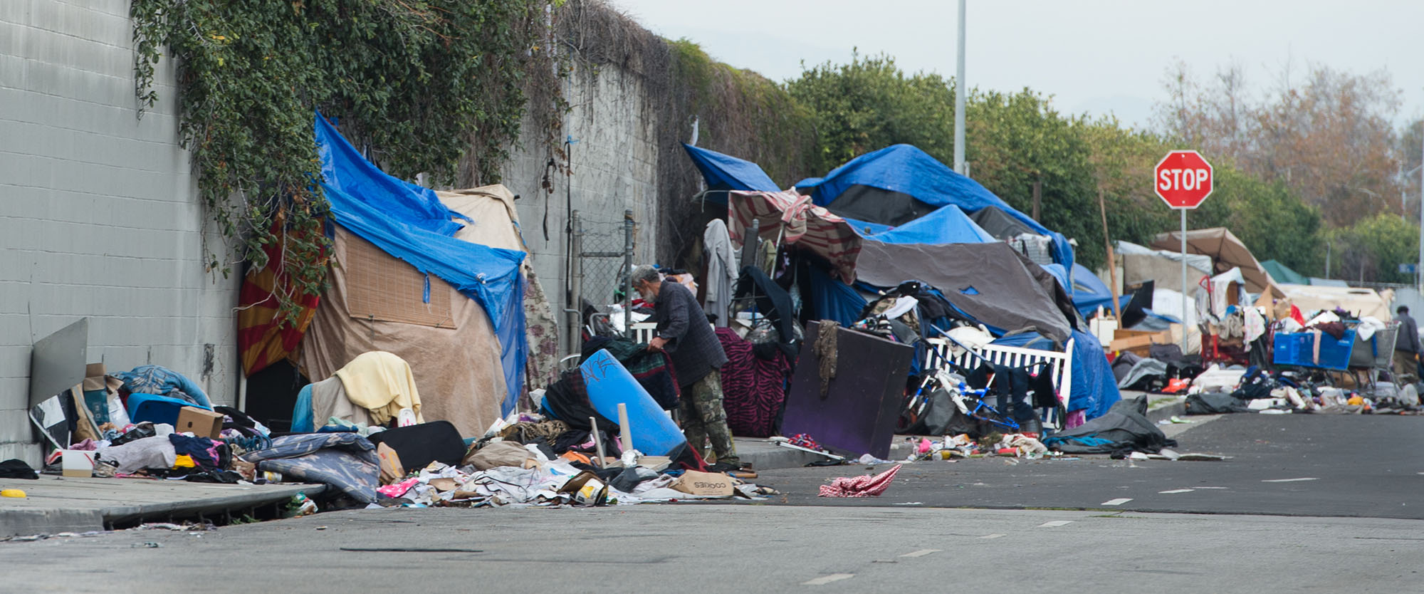
Photo by LA Times
Programming Language: R
Project Goal
The goal of this project is to provide insightful geographic, demographic, and time indicators of homelessness in The City of LA. All the reports in our dashboard are integrated into an online mapping application that will enable Mayor’s office staff to evaluate and track the effects of existing and upcoming homelessness interventions. Also, it will allow the Mayor’s office to analyze data more systematically and facilitate the rapid deployment of resources and services.
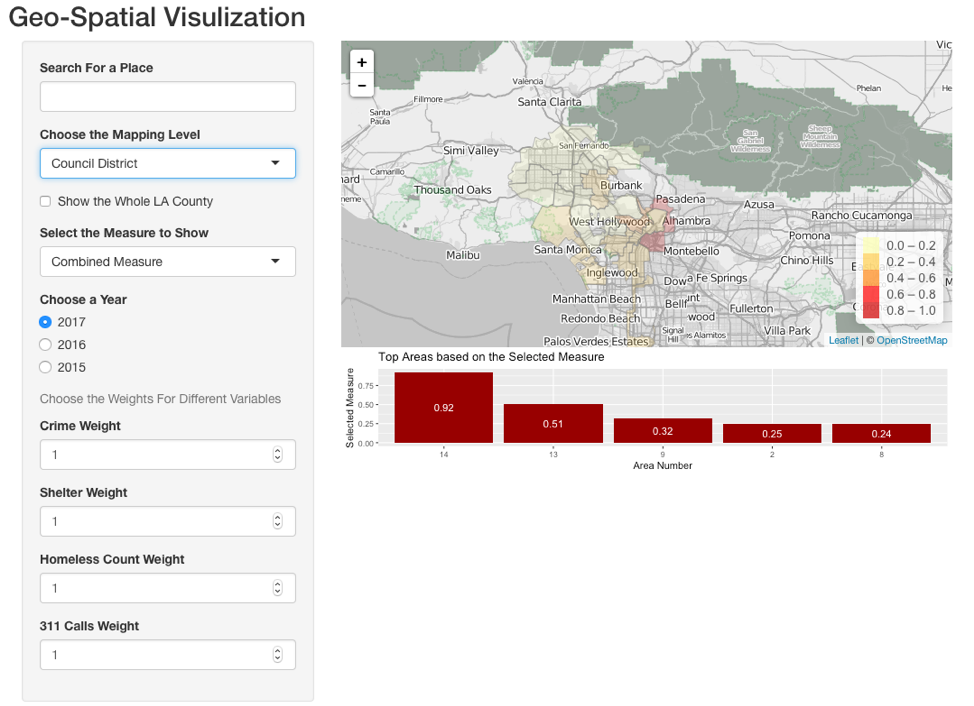
Geographical Analysis
The dashboard offers several adjustable measurements based on specific parameters to users. For example, crime measurements help users navigate particular locations with crimes (higher or lower). The primary goal of this dashboard is to improve the City of LA analyzing potential locations of homeless and already risked locations of homeless.
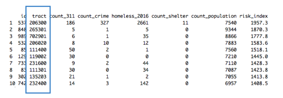
Choose the mapping level, select the combined measure to show a map of the risk index of different area based on council district or census tract. The user can manually enter the risk weights for those four variables (crime, shelter, homeless, 311 calls), then get the area with the highest risk index. We also have unique features such as “Search for a Place” to help users understand the geospatial analysis data from a particular location such as USC.
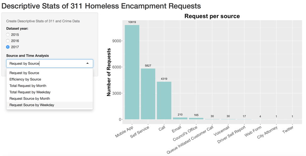
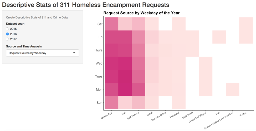
Time Based Analysis
In this dashboard, we analyze descriptive statistics of the number of homeless encampment requests per source. The panel has three datasets from 2015 - 2017. The most popular channel or source people used to call 311 is a mobile app. As the more smart-phones are affordable, mobile apps become a powerful tool to call 311. For these reasons, to anticipate the peak concurrent users in any given period, the City of LA should maintain the reliability of the mobile app. Also, another panel shows total request by weekday.
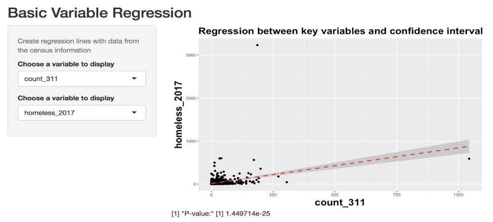
Predictive Modeling Analysis
We also apply some introductory regression models to spot any important correlation between homeless factors.
Along with general solutions like creating new jobs or ask for donations, we ended this project with an actionable recommendation: The government should build more shelters in these areas listed below (based on the census tract). This recommendation is a result of different analysis methods that we undertook (geospatial analysis, time-based analysis, and predictive modeling analysis).
Tools & Further Resources:
- Shiny App Prototype
- Github Link
- Tidyverse
- Ggplot2
- Leaflet
- Shiny
- Linear modeling